
Decoding WebofScience stats using Python
Using python to find key trends and visualize patterns while conducting literature review


Written by Sai Gattupalli
In this blog post, you will journey through a dataset supplied by WebofScience that captures a decade of scholarly insights on multicultural education. Using sample Python code, I will distill key trends, visualize patterns, and unravel the nuances of this vital discourse.
import pandas as pd
import matplotlib.pyplot as plt
df_multicultural_tech = pd.read_excel('dataset.xls')
# Extracting relevant data for viz
publications_per_year = df_multicultural_tech['Publication Year'].value_counts().sort_index()
df_multicultural_tech['Country'] = df_multicultural_tech['Addresses'].str.extract(r'([A-Z][A-Z]$)')
publications_per_country = df_multicultural_tech['Country'].value_counts()
all_research_areas = df_multicultural_tech['Research Areas'].str.split(';').explode().str.strip()
publications_per_discipline = all_research_areas.value_counts()
# Plotting the visuals
fig, axes = plt.subplots(nrows=3, ncols=1, figsize=(14, 18))
# Plotting pubs per year
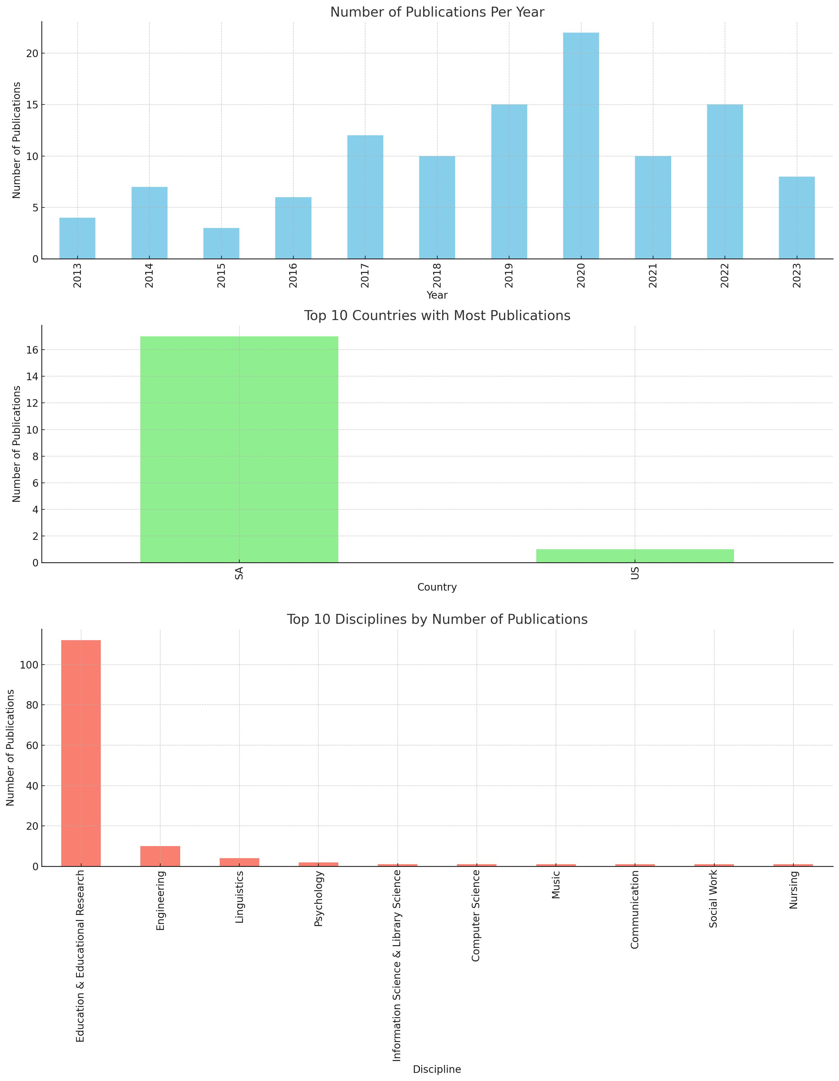
publications_per_year.plot(kind='bar', ax=axes[0], color='skyblue')
axes[0].set_title('Number of Publications Per Year')
axes[0].set_xlabel('Year')
axes[0].set_ylabel('Number of Publications')
# Plotting distribution of pubs by country
publications_per_country.head(10).plot(kind='bar', ax=axes[1], color='lightgreen')
axes[1].set_title('Top 10 Countries with Most Publications')
axes[1].set_xlabel('Country')
axes[1].set_ylabel('Number of Publications')
# Plotting distribution by discipline
publications_per_discipline.head(10).plot(kind='bar', ax=axes[2], color='salmon')
axes[2].set_title('Top 10 Disciplines by Number of Publications')
axes[2].set_xlabel('Discipline')
axes[2].set_ylabel('Number of Publications')
plt.tight_layout()
plt.show()
After supplying data from WoS, here is the output:
Until next time.